Getting started with SwiftUI (Stanford CS193p)

This struct behaves like a view (the struct conforms to the View protocol)
The View protocol requires you to have the body variable (of type ‘some View’)
struct ContentView: View {
	var body: some View {

	}
}
The block (curly brackets) after the variable declaration represents a function (closure) and the value it returns gets assigned to the variable body. As long as it is a view (VStack, Text, Image, etc) it is ok to assign it. (note: writing the keyword return here is optional!)
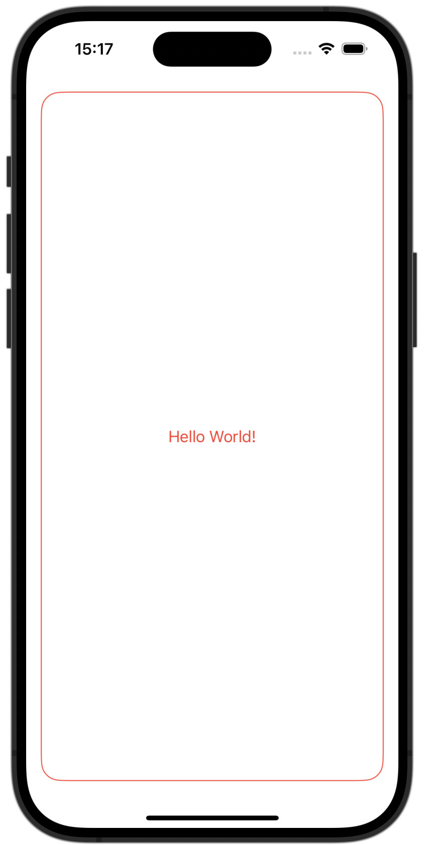
struct ContentView: View {
	var body: some View {
		return Text("Hello World!")
	}
}
Shapes
RoundedRectangle()
We can return the RoundedRectangle() view specifying its cornerRadius and calling modifier functions like .padding() (can receive an optional argument like .horizontal) and .stroke() (contrary to .fill()) to outline a shape (can receive an optional argument like lineWidth: 3).
struct ContentView: View {
	var body: some View {
		RoundedRectangle(cornerRadius: 20)
			.stroke()
			.padding()
	}
}
struct ContentView: View {
var body: some View {
RoundedRectangle(cornerRadius: 20)
.stroke(lineWidth: 3)
.padding(.horizontal)
.foregroundColor(.red)
}
}Tip: You can write just .red instead of Color.red when defining the foreground color.
View Combiners
The ZStack()
The ZStack() receives a closure as a parameter. (this closure is called a View Builder)
struct ContentView: View {
	var body: some View {
		ZStack(content: {})
	}
}
The View Builder allows us to list all the views we want to combine and turns it into another view. You also don’t need to write return inside the View Builder.
    var body: some View {
        ZStack(content: {
            RoundedRectangle(cornerRadius: 20)
                .stroke()
                .padding()
            Text("Hello World!")
        })
    }
Modifying the View Combiner
Applying a modifier function to a view combiner will apply the properties to all the view within it.
    var body: some View {
        ZStack(content: {
            RoundedRectangle(cornerRadius: 20)
                .stroke()
            Text("Hello World!")
        })
        .padding()
        .foregroundColor(.red)
    }
Preview:
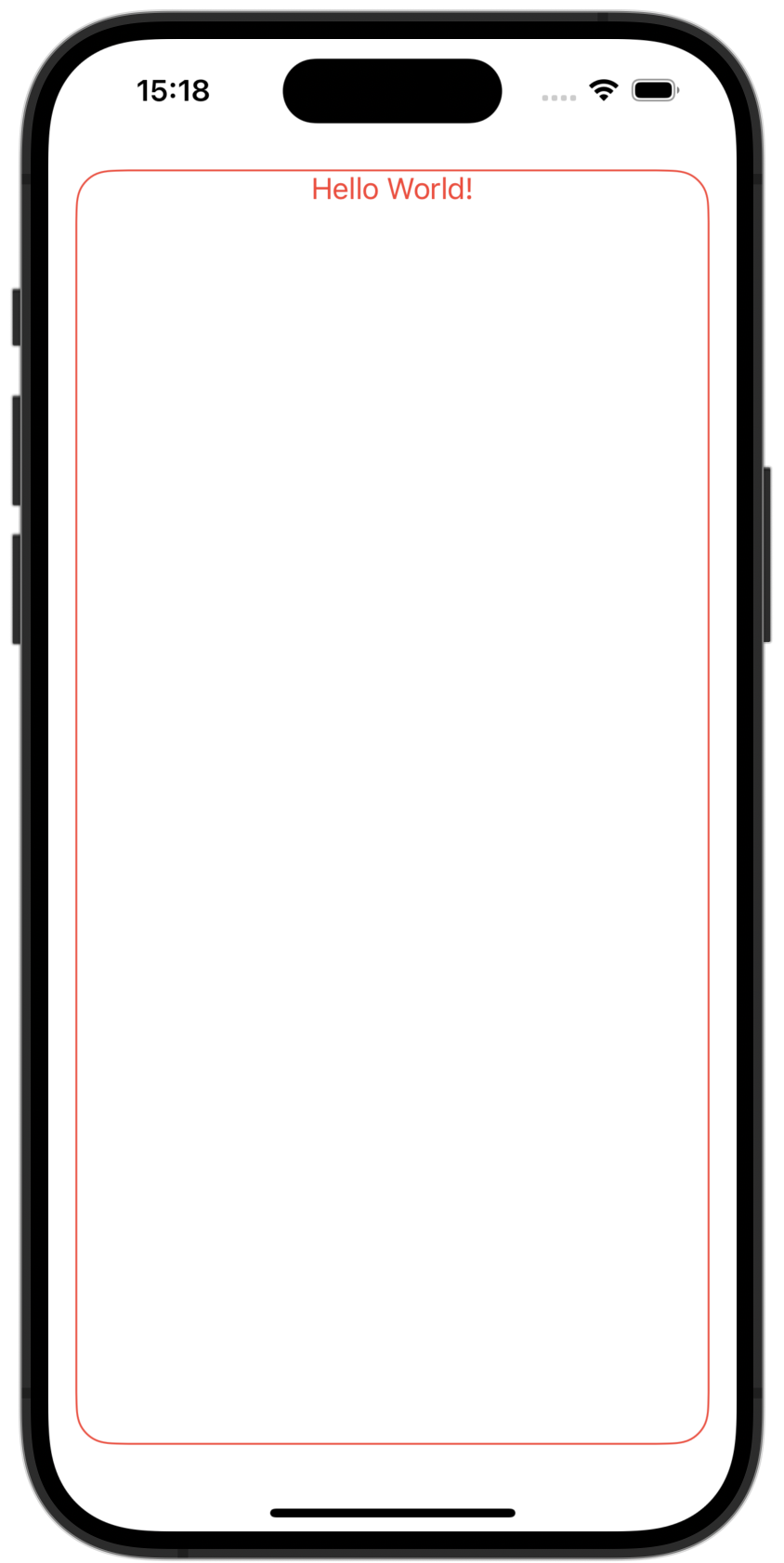
Setting the alignment
    var body: some View {
        ZStack(alignment: .top, content: {
            RoundedRectangle(cornerRadius: 20)
                .stroke()
            Text("Hello World!")
        })
        .padding()
        .foregroundColor(.red)
    }
Preview:
Simplifying the code
When the last argument of a function is also a function you can simplify the code like this:
This code:
    var body: some View {
        ZStack(content: {
        })
    }
becomes:
    var body: some View {
        ZStack() {
        }
    }
You can also remove the parenthesis from the ZStack
var body: some View {
ZStack {
}
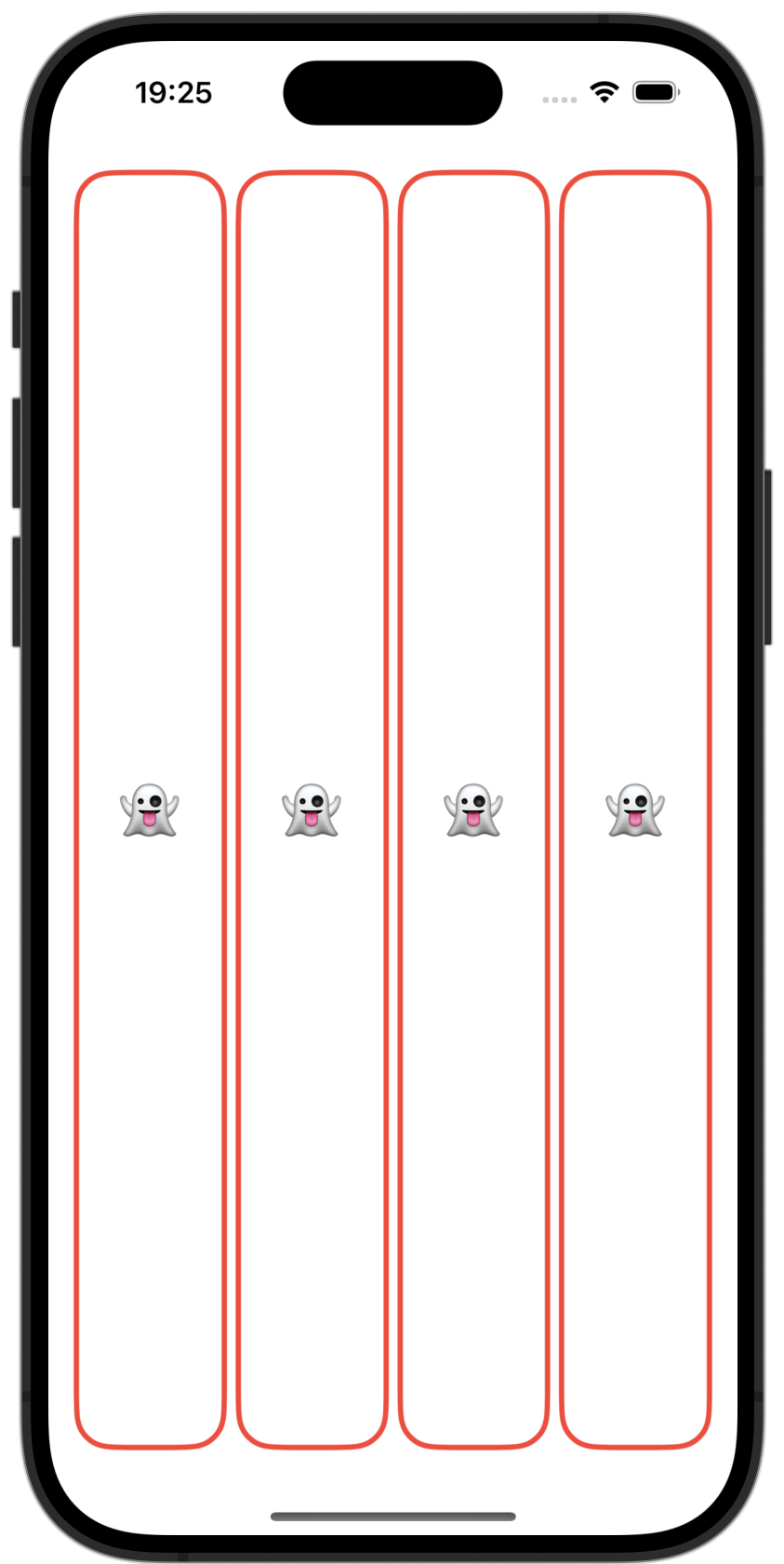
}Encapsulating views
To avoid redundancy, we can get our ZStack representing a card and turn it into a view itself.
struct CardView: View {
    var body: some View {
        ZStack {
            RoundedRectangle(cornerRadius: 20)
                .stroke()
            Text("👻")
        }
    }
}
And then call it form the ContentView in a HStack (horizontal stack):
struct ContentView: View {
    var body: some View {
        HStack {
            CardView()
            CardView()
            CardView()
            CardView()
        }
        .padding()
        .foregroundColor(.red)
    }
}
Creating local variables
Instead of repetitively calling RoundedRectangle(), we can assign it to a variable (rectangle in this case) and use it instead to make our code look cleaner.
let rectangle = RoundedRectangle(cornerRadius: 20)
rectangle
	.fill()
	.foregroundColor(.white)
rectangle
	.stroke(lineWidth: 3)
Text("👻")
	.font(.largeTitle)
Flipping the card using boolean values
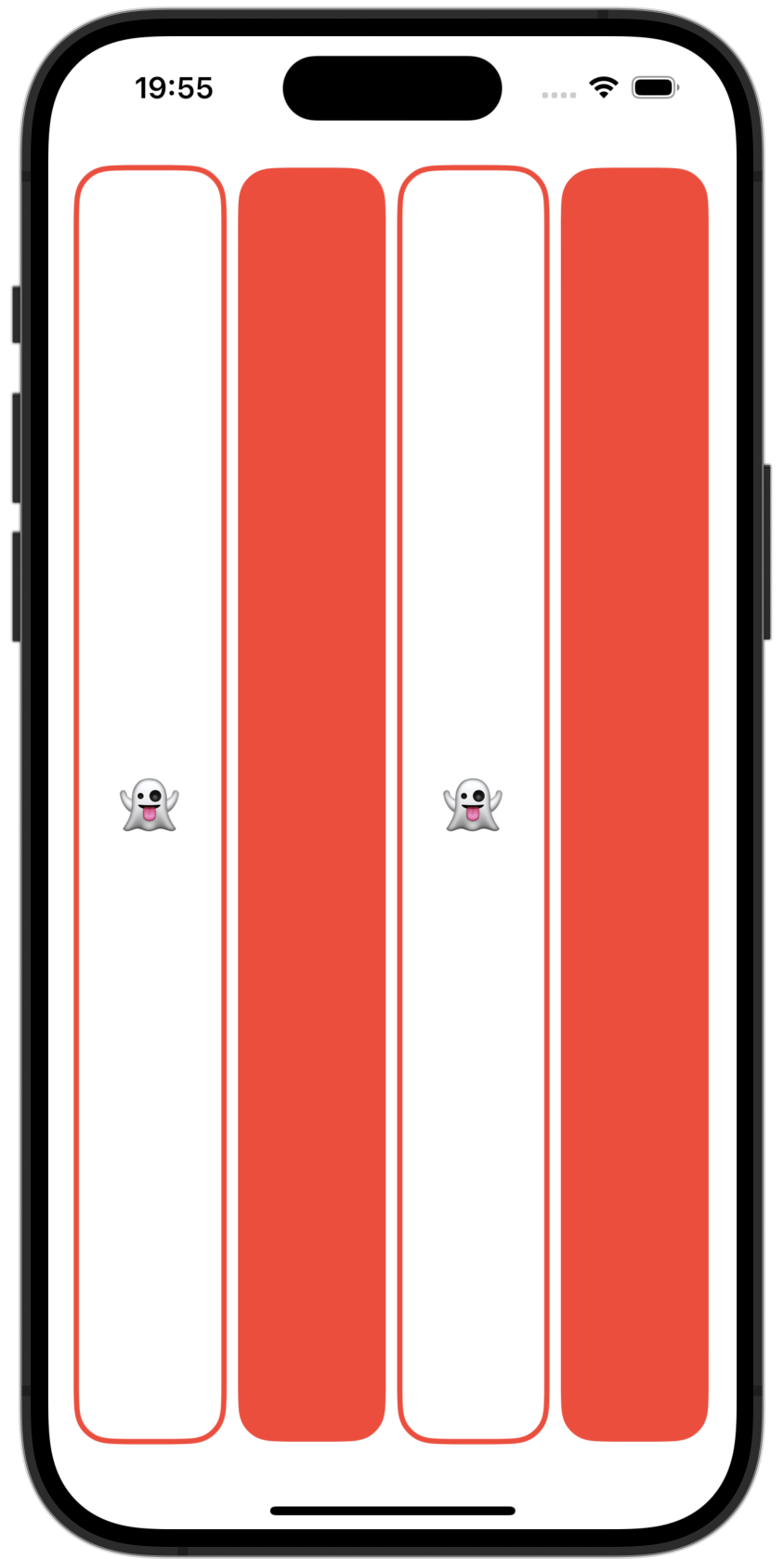
Here, we created a boolean variable called isFaceUp and initialized it to true. Then, using the if control flow structure, we can change what kind of view we would like to display (if it is the card with a white background and text or just a card filled in red.)
var isFaceUp = trueif isFaceUp {
rectangle
.fill()
.foregroundColor(.white)
rectangle
.stroke(lineWidth: 3)
Text("👻")
.font(.largeTitle)
} else {
rectangle
.fill()
}Passing isFaceUp as a parameter when calling CardView:
HStack {
	CardView(isFaceUp: true)
	CardView(isFaceUp: false)
	CardView(isFaceUp: true)
	CardView(isFaceUp: false)
}
View Mutability and @State
If we try to add .onTapGesture() to our ZStack to change the value of a variable, we will get an error because all views are immutable. In this case, we want to change the value of isFaceUp, but as it is not possible we can add @State to it to turn it into a pointer to a boolean to somewhere in memory and whenever it changes the body view gets rebuilt.
@State var isFaceUp = true

var body: some View {
	ZStack {

	}
	.onTapGesture {
        isFaceUp = !isFaceUp
    }
}
Using dynamic text
We can create a new variable inside our CardView called content (representing the content for the Text) and pass the content dynamically from the ContentView:
struct CardView: View {
	var content: String

	var body: some View {
		ZStack {
			...
			Text(content)
			...
		}
	}
}
Then from the ContentView, let’s create an array of strings for the card contents and indexing from this array when passing the content to the CardView
struct ContentView: View {
	var emojis: [String] = ["👻", "⛩️", "🔗", "🌹"]

	var body: some View {
		HStack {
			CardView(content: emojis[0])
			CardView(content: emojis[1])
			CardView(content: emojis[2])
			CardView(content: emojis[3])
		}
	}
}
But, to write it in a less methodical way we can use a ForEach statement with emoji being a variable representing the current item from an iteration.
ForEach(emojis) { emoji in
	CardView(content: emoji)
}
But the code above will not work because to use a ForEach we need to make each item from our array conform to the Identifiable protocol meaning that each item must be unique and have an ID.
To solve this problem, we can add id as a parameter to ForEach and set it to \.self meaning that the variable itself is going to be it’s own ID.
ForEach(emojis, id: \.self) { emoji in
	CardView(content: emoji)
}
Working with ranges
Imagine we have a really long array and only want to display emojis from a certain range. We can achieve this by using the indexing syntax.
Example:
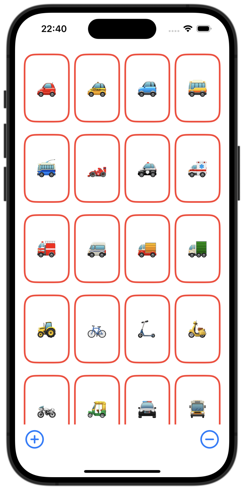
var emojis: [String] = ["🚗", "🚕", "🚙", "🚌", "🚎", "🏎️", "🚓", "🚑", "🚒", "🚐", "🚚", "🚛", "🚜", "🚲", "🛴", "🛵", "🏍️", "🛺", "🚔", "🚍", "🚘", "🚖", "🚡", "🚠", "🚟", "🚃", "🚞", "🚝", "🚄", "🚅"]

0..<5 //Will exclude the 5
0...5 //Will include the 5
Now, let’s index emojis inside out ForEach to only the first 4 items:
ForEach(emojis[0..<4], id: \.self) { emoji in
    CardView(content: emoji)
}
Buttons
Now we are going to add a button to add and remove cards. This is how we use a Button in Swift:
Button(action: {}, label: {})We can now create a variable to keep track of how many items we want to display and set it as the range when iterating through the emojis array:
@State var emojiCount = 4

...

ForEach(emojis[0..<emojiCount], id: \.self) { emoji in
    CardView(content: emoji)
}
Now, we can create 2 buttons and increment/decrement this variable (Inserting it into a horizontal stack and adding a Spacer() in between the 2 buttons.)
HStack {
	Button(action: {
		emojiCount += 1
	}, label: {
		Text("+")
	})
	Spacer()
	Button(action: {
		emojiCount -= 1
	}, label: {
		Text("-")
	})
}
.padding()
Now, to clean up the code we can turn the block of code for creating the Button into a new variable of type some View and use it instead.
var add: some View {
	Button(action: {
		emojiCount += 1
	}, label: {
		Text("+")
	})
}
var remove: some View {
	Button(action: {
		emojiCount -= 1
	}, label: {
		Text("-")
	})
}
And use it like this:
HStack {
	add
	Spacer()
	remove
}
Using SFSymbols for the buttons
Syntax:
Image(systemName: "SYMBOLNAME")Use case:
Button(action: {
	emojiCount -= 1
}, label: {
	Image(systemName: "minus.circle")
})
Syntactic sugar for simplifying the Button syntax
Button(action: {}, label: {})Becomes:
Button {} label: {}Adding limits for our ranges
When incrementing/decrementing emojiCount, we have to be careful to not let it get to an invalid index inside our array (a value less than zero or upper to the array’s number of elements.)
var add: some View {
	Button {
		if (emojiCount < emojis.count) {
			emojiCount += 1
		}
	} label: {
		...
	}
}

var remove: some View {
	Button {
		if (emojiCount > 1) {
			emojiCount -= 1
		}
	} label: {
		...
	}
}
Grids
We can use a LazyVGrid Instead of the HStack to order our cards into a grid. (When using a LazyVGrid we only have to specify the number of columns and all the rows are going to be created as necessary contrary to a LazyHGrid)
LazyVGrid(columns: [GridItem(), GridItem(), GridItem()]) {
	ForEach(emojis[0..<emojiCount], id: \.self) { emoji in
		CardView(content: emoji)
	}
}
where columns is an array of GridItem()
Setting the aspect ratio for a card
We can call .aspectRatio() on our CardView to set the aspect ratio like this:
CardView(content: emoji).aspectRatio(2/3, contentMode: .fit)Sets the aspect ratio to 2 wide / 3 high.
Using a scroll view
We can wrap our LazyVGrid into a ScrollView to be able to scroll:
ScrollView {
	LazyVGrid(columns: [GridItem(), GridItem(), GridItem()]) {
		ForEach(emojis[0..<emojiCount], id: \.self) { emoji in
			CardView(content: emoji).aspectRatio(2/3, contentMode: .fit)
		}
	}
}
Working with an adaptive grid item
We can set our array of grid items to just one GridItem() and make it adaptive setting the minimum width for the row.
GridItem(.adaptive(minimum: 80))ScrollView {
LazyVGrid(columns: [GridItem(.adaptive(minimum: 80))]) {
ForEach(emojis[0..<emojiCount], id: \.self) { emoji in
CardView(content: emoji).aspectRatio(2/3, contentMode: .fit)
}
}
}